
Lahti has updated its look. Advertising and marketing no longer rely on jump scares, although they have influenced the new logo. The new look and the Lahti logo will be visible in all communication in the city.
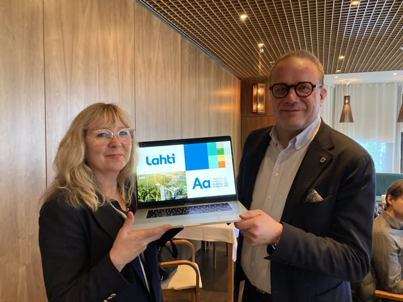
Lahti has a new look. The old logo has been replaced by Lahti, written in fonts specially developed for Lahti.
The new look no longer includes familiar landmarks such as the Kiveriö water tower, the Town Hall, the Sibelius House or the ski jump. The new look will be reflected in all the city’s communications, be it outdoor advertising, forms, websites or newsletters.
The colours of the colour scheme are named after the Lahti theme: for example, deep blue is the name of the lake, yellowish is barley, turquoise is air and grey is concrete.
A logo should always say something about what it represents. According to Timonen, the new logo tells about Lahti as it is now.
– It tells about a city that looks ahead with confidence, lives in time and has a can-do attitude.
We will gradually move to the new look during the current year. The change starts with digital communication and is gradually reflected in all the city’s communication.
A new look does not just happen
Lahti’s new look is a carefully thought-out entity that is designed to work in a digital environment as well. Lahti’s new signature colors and the base designed for communication, which changes according to the situation and need, meet the communication needs of today and the future.
Planning for the change started years ago. The final process started last September.
In the competition, the design price was set at 43,000 euros.
– Many big events will be held in Lahti this year, starting with the Salpausselä Games, so we have many good opportunities to make the new look familiar both in Finland and around the world, says Timonen.